What initially drew you to this line of work in the first place?
I was in design school, so doing creative work inside a creative industry is the dream. I grew up in the nineties, so for me, Sundance Institute was the epitome of cool in the filmmaking world. I remember trying to sneak into sex, lies, and videotape. I wasn’t 17, and I grew up in South Carolina, so it was super strict. I just remember it being on the marque and just being like, what is that film? I don’t remember the first time I heard of Sundance in the ‘90s, but it was just one of those things that you always knew was the place.

What is the process like when you’re collaborating with an agency on Festival art?
I tap creatives who I feel are just innovating, who are top of their field. We’re looking for diverse people. So, I went global. Sulki and Min, they’re partners in life and in work and are based in Seoul. They were trained at Yale, and they kind of had this whole just a unique perspective, and were just really innovative.
It always comes back to the mission and always comes back to that intent, of course, of next gen voices. And then also, nature has played a huge part and has been so influential. It’s a backbone of Sundance that I always come back to. It is very special. It sets us apart in terms of the type of Festival we are — back to the Redford mission of getting out of the city. And so that’s how we briefed Sulki and Min. And I think they brought a unique perspective to what that meant. And they came up with this iconographic style and created a custom tight face that almost felt like having a very symbolic written language. I do feel like that had an influence on the typography, on the English typeface that they made the symbolic hybrid of our house font.
That was a really interesting innovation of here’s the house font, but we’re going to plus it up in this manner. And again, it’s allowing them space and guiding that process first.

Is it challenging trying to translate often abstract designs to everything from signage to merch?
As a designer, you often want to push it and do something really bold. But that’s where the creative in-house has to say, “Hey, love that, but we can’t do certain things.” So, part of my job is to say, “Here’s what the team needs in order to blow this out.”
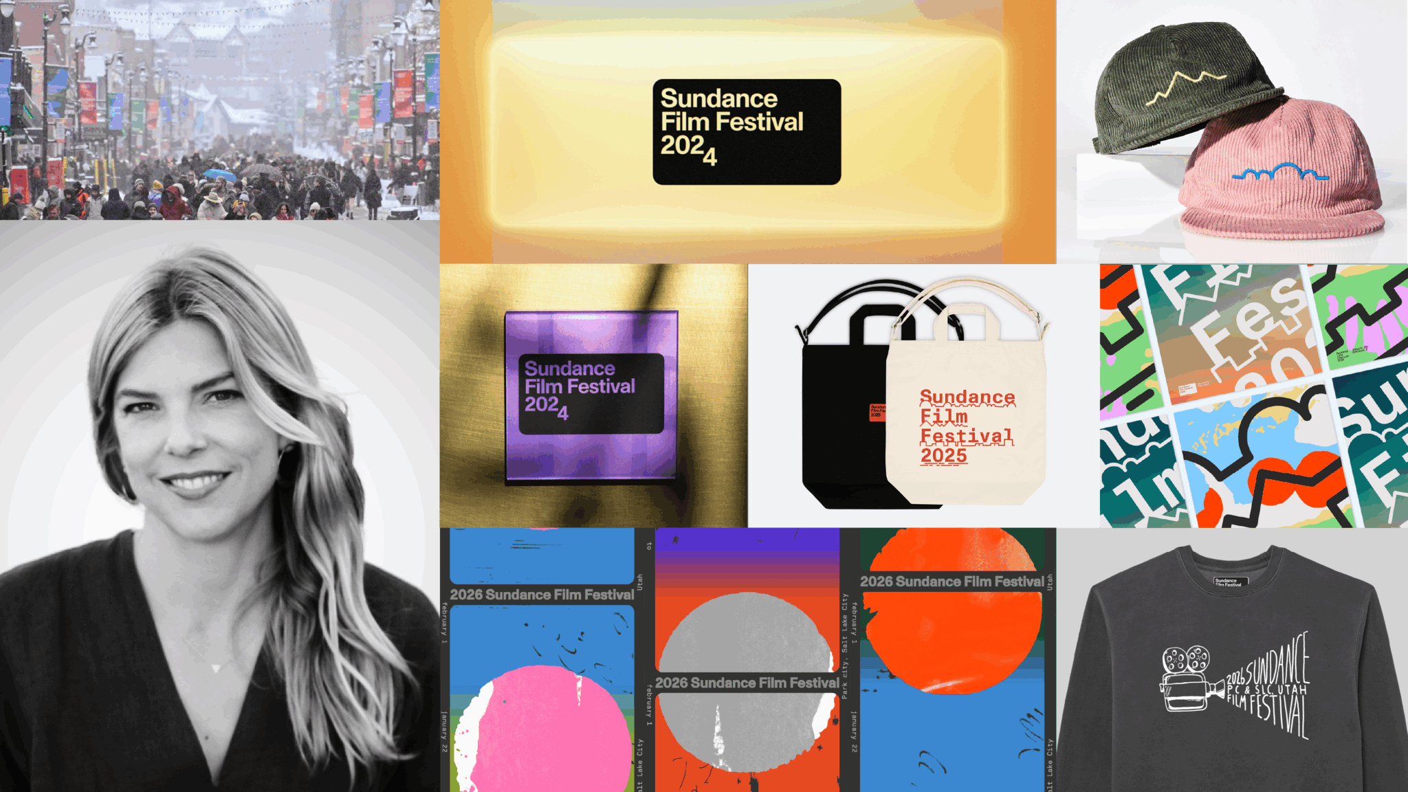
But the goal for the design is definitely to be very unique. Since the 2023 design by Porto Rocha, the idea has been to iterate off of the frame. So they sort of establish this idea of frames and this conceptual idea of inviting people in that’s, in a way, framing up perspective. And so every year since then has been an iteration on that idea.

For the 2026 Festival design, was there a specific mood or color palette you were going for?
This year, I did have something pretty clear in my mind. It was definitely a response to the AI conversations that were just so prolific and predominant this past year. I guess it triggered the question of what does something being made by an artist mean? And what is something made by hand? And again, as an independent artist, what are the tools that you’re relying on? And I do believe in the fundamentals of art of design. A lot of times it’s just starting with a piece of paper and starting to sketch things out. I think the same is true for a story or an idea that you’re making in film. There’s a lot of parallels there of starting with the basics. You need a great script. You’ve got to start with words. AI can be a tool that we can use, but you have to start with a human-generated something. That’s ingenuity.

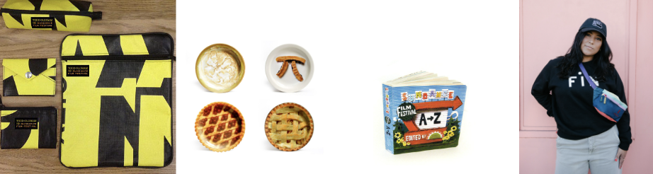
Speaking of starting with a sketch or outline, we get that feel from the design on Fest merch, like the Doodler 32 ounce Nalgene Water Bottle, the Egyptian marquee drawing on the Marquee on Main Tee, and the graphic of a movie projector on the Analog Fleece Crew.
Donald Choque and Yoann LeGoff [who make up Choque LeGoff], their amazing painters and drawers, and they do a lot of hand technique and their work. [Graphic designer] Miles [Fujimoto] has those hand skills. How I’ve curated the team is really important to me. It’s really important to have people who know the fundamentals and express themselves in lots of different ways. So, Miles’s work happened to fold into the work that they did. And it is a little bit of a departure, but it’s a way for us to also riff and talk about things that are a little bit hard to represent.
It’s like, how do you represent our Pass and Package sale? We can show audience shots, certainly we can show the experience of the Festival, but these designs give people a quick way to connect with the messaging that we’re giving people.
When you look back at some of the Festival art of the past, which years really stand out to you?
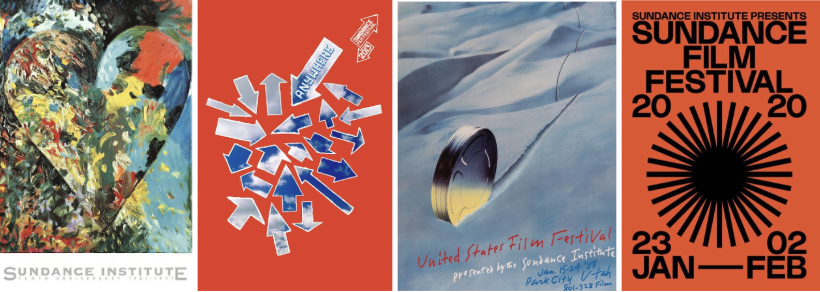
That Jim Dine one — I’m obsessed with the heart. I mean, he’s a very famous painter. And Paula Scher did the 2013 poster. She is one of the most famous women in design. Also, the 1988 poster — when the Festival was called the United States Film Festival — that was designed by Saul Bass. He is a legend in film poster world. I like the rough handwriting and the the icon of the mountain. The design is classic, simple, and iconic. The 2020 design Festival look and feel is also one of my favorites in terms of sort of a recent design.