


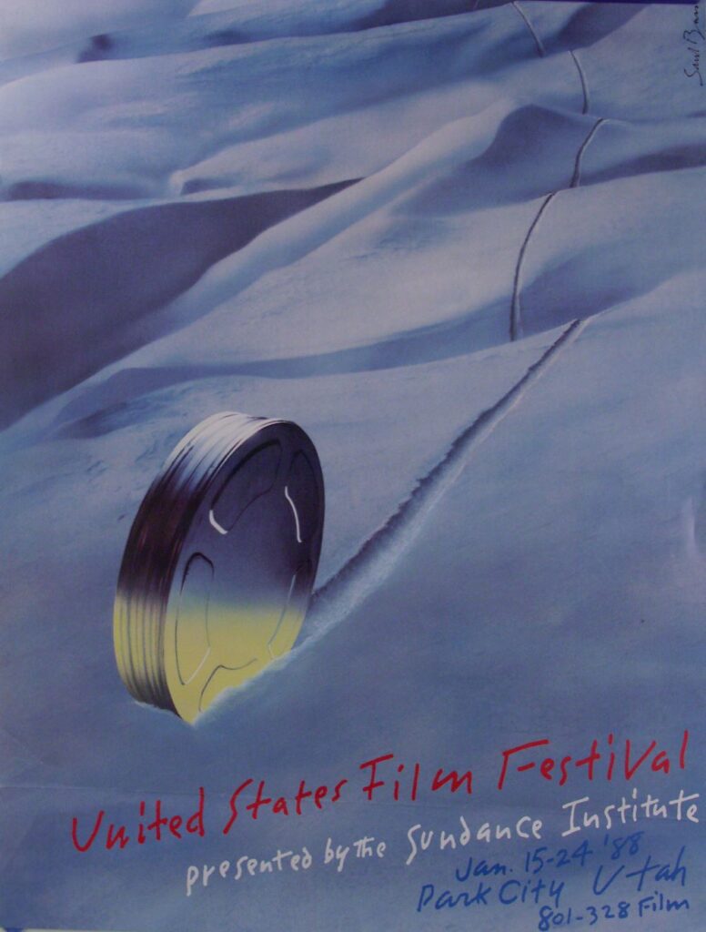


Multi-year affiliation unites the world’s premier independent film organization with California’s leading public film school, beginning fall 2026 LOS ANGELES, [July 14, 2026] — UCLA’s
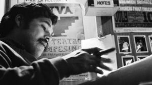
Director David Alvarado shines a spotlight on the filmmaker, activist, and vital figure in the history of Mexican American culture, art, and political consciousness.
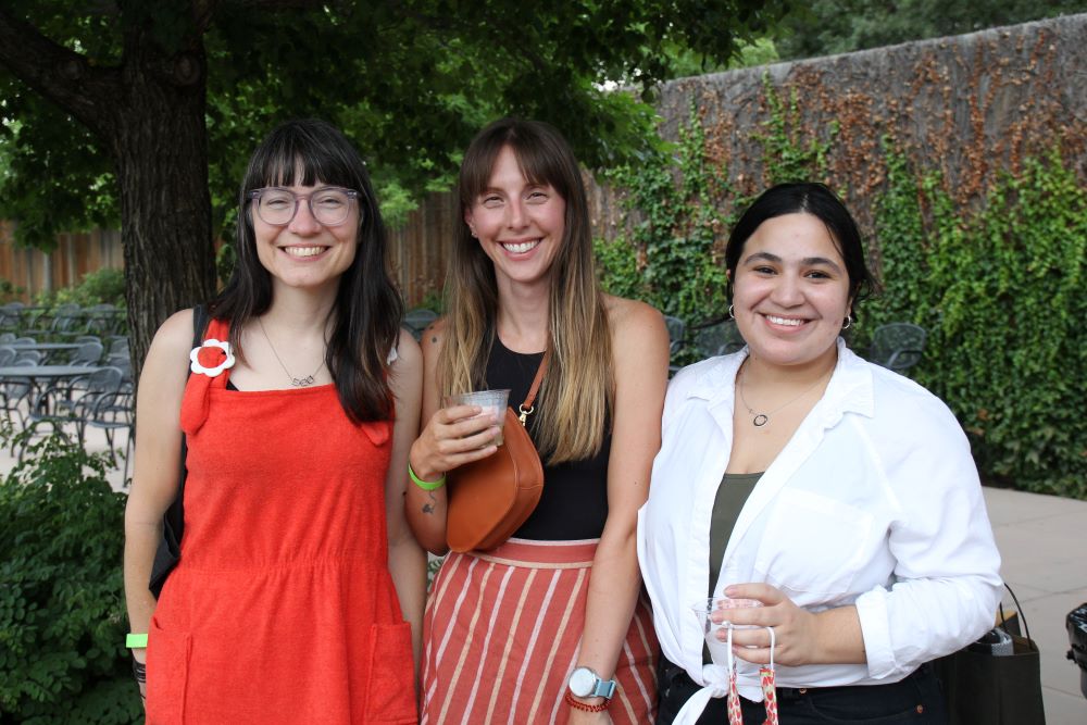
(L–R) Stacey Lee, Adam Montgomery, Andreas Dalsgaard, and Christoph Jörg attend the Episodic Nonfiction Pilot Showcase during the 2026 Sundance Film Festival at The Yarrow